Are you searching for the best mobile-friendly WordPress themes?
Table of Contents
You’re in the right place! This post covers the top WordPress themes built with mobile optimization in mind.
Perfect for businesses and individuals targeting a mobile-first audience, such as app developers, tech companies, or bloggers, these themes ensure seamless experiences on smartphones and tablets.
Premium Mobile Friendly WordPress Themes and Templates
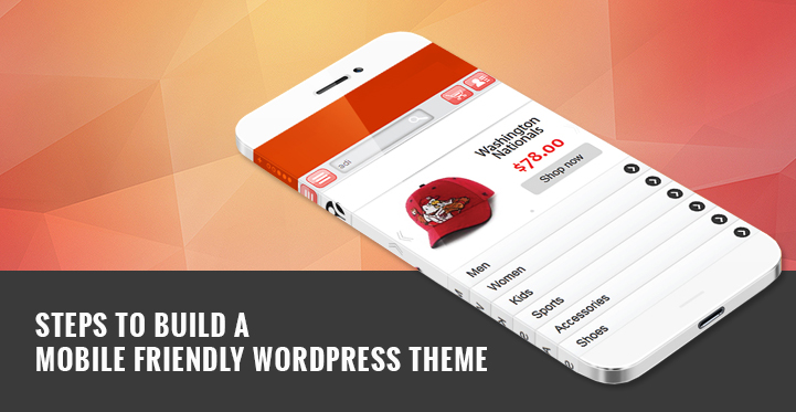
Steps to build a mobile friendly WordPress theme have been discussed in this article.
With the huge boom in the number of mobile phone users, the web activity via cellular devices is becoming increasingly common. With the passage of time, mobile phones are becoming an important part of our lives.
This is largely due to the fact that it allows us have ease in multiple walks of life. With the ownership of mobile phone and access to the internet, you can connect with anyone in the world. To simplify your daily tasks, there are multiple tools in the form of applications.
In a nutshell, mobile phones have made life easy. Based on this assumption, we can safely propose that the society has all the just reasons to be reliant on such a device.
What important features make a mobile-friendly WordPress theme effective?
These paid mobile friendly themes offer a range of features to elevate your website’s design and functionality. So, let’s check some of the different features required.
- Fully Responsive Layout
- Mobile-Optimized Design
- Custom Widgets
- Social Media Integration
- Translation Ready
- Touch-friendly Elements
- Clean Code
- Fast Loading Speed
- Blog Layouts
- SEO-Friendly
Keeping in mind the utmost need and necessity of mobile phones in this age of technology, this fact cannot be negated that there is an increase in the number of website visits from this device. This fact calls for the need of having mobile friendly WordPress themes.
Considering this, we will walk you through different steps to build mobile friendly WordPress themes.
This will help you tap into a large market of users who use applications or surf websites through their mobile phones. Moreover, if you are able to build mobile friendly websites then you will rank better on search engines.
As a result, a larger audience of people will benefit from your services. In a nutshell, there are multiple reasons that should lead you to making your website mobile friendly.
Here you will learn how to create responsive WordPress themes. So, let’s jump on to it!
1. Choose the right hosting plan

This is one of the first and foremost requirements when you are planning to build a mobile friendly WordPress theme. A good hosting company always aids you to optimize the website perfectly well for mobile phones. In this regard, here are a few things that you should consider.
- Your website should not be shared over a common server. This is because of the fact that, over common servers the loading speed is slowed down multiple folds.
- Go for quality services over anything
- The traffic towards your website must be handled very efficiently by the hosting company
Before actually stepping into the playground of making responsive WordPress themes, it is recommended that you keep in mind the above instructions.
2. Make the correct choice of WordPress theme

After the choice of the most suitable hosting plan, you are now required to choose a responsive WordPress theme. There are a few considerations that should be kept in mind:
- The theme should load very fast
- Should adjust to all the screen sizes and dimensions
- Adheres to all your organizational objectives
- Suffices for the purpose of delivering service to the audience
- Offers great user experience
- Should be cross browser compatible and cross device compatible
- Should be checked with Theme Authenticity Checker and Theme check plugins for security purposes
Moreover, you should avoid themes that:
- Are not coded professionally
- Have got a lot of images
- Take a lot of time to load
3. The Content Should be Adaptive

It simply means that mobile friendly WordPress themes require such content that is easily scalable based on the size of the device.
In other words, the adaptive content has got the ability to scale up or scale down its dimensions depending on the device. One of the best techniques in this regard is to make the content catchy and very precise.
This makes it even more adjustable. On top of that, visual representations such as graphs should be avoided as they are not suitable for the size of some devices.
4. Have a check on the plug-ins

Always keep it simple. Make use of very less plug-ins and ensure that you deliver maximum user experience through minimum effort. Jamming a lot of plug-ins to your WordPress website can cause a lot of issues.
This includes slowing down of the website and sometimes problems with various functionalities due to conflict among the plugins.
Thus, it is suggested that you keep a strong check on the plug-ins.
5. Image Optimization

It is a general understanding and fact that images play an important role to keep the users engaged. There is no way to negate the importance of images. However, cluttering too many images on your website can slow down the loading speed.
This negatively affects the user experience. Thus, it is really important that you optimize your images in such a way that there is a proper balance between the speed and user experience.
This applies especially to the mobile website. Thus, it is recommended that while making a responsive WordPress theme – pay special attention to the image optimization.
6. Installation of a theme-switcher

This is extremely important especially when you have decided not to use a plug-in for the provision of a theme. There is a variation in the level of control that each plug-in offers.
Thus, it is required that you make a wise choice during the selection. Ensure that all the requirements of the targeted platform are properly sufficed.
For a better approach, the choice of “any mobile theme plugin” is recommended. It is one of the best plug-ins to make mobile friendly WordPress theme.
7. Test, test and test

Once you are through the above checklist of tasks, the next step is to test the website. Make sure that you pay proper attention to all the performance parameters.
No matter, how detailed the checklist is – you should never reach conclusions without proper testing in that matter.
For proper testing and check, it is recommended that you test and check the website on multiple mobile devices. Browse through various sections and interact with various elements to have a better idea of everything.
With this type of testing and proper attention to detail, it will be rest assured that you have a mobile friendly WordPress theme. In other words, you will be providing services and better experience to a large audience of people.
 Sonal S Sinha is a digital architect and seasoned developer with over 16 years of experience in the web world. As the founder of a premier design and marketing agency, he has helped thousands of startups and small businesses define their identity through custom WordPress theme development.
A self proclaimed WooCommerce enthusiast, Sonal is dedicated to making professional design accessible to everyone. He regularly shares his expertise and a curated selection of free WordPress themes to help new creators launch with confidence. Follow Sonal for a consistent masterclass in scaling your online presence.