Sonal S Sinha Moderator
Topics: 0 Replies: 31231 Total: 31231
Member since: August 16, 2013
Hi,
Kindly go to Appearance >> Customize >> Front Page >> Section >> and change section background color
Regards,
Mika Sauren Participant
Topics: 36 Replies: 64 Total: 100
Member since: August 8, 2019
Thank you, now its set ok. But is it possible to chance border color of logo area and can chance background color of same area?
Hi, i would like to adjust Adventure theme home section 1, i like ti use [client image=”http://avtel.fi/wp-content/themes/skt-naturo-pro/images/client-logo1.jpg” ; link=”#”] shortcodes here. But can adjust padding top and bottom of section, also is it possible to chance border color of logo area and can chance background color of same area?
Keith Participant
Member since: November 14, 2016
I’m using the Fundraiser theme. My Social Icons aren’t displayed as they do in the online demo. Instead, they’re very small and don’t have the background color.
My site is: https://symmetryptmiami.com/
Kindly check the Social Icons on the top-right-hand-side, and bottom-right-hand-side of the website.
In your banking demo – http://sktperfectdemo.com/demos/banking
On my site – https://leapforwardinc.imaginativedata.com
Doug
Sonal S Sinha Moderator
Topics: 0 Replies: 31231 Total: 31231
Member since: August 16, 2013
Hi,
Kindly go to Appearance >> Customize >> Basic >> Scroll down to find Custom CSS and paste there:
#topmenu ul li a { padding:35px 20px 20px;}
.header { background-color: transparent; background-image: url(https://apurvy.com/wp-content/uploads/2019/12/tenor.gif);}
Regards,
Zainab Gurka Participant
Topics: 101 Replies: 91 Total: 192
Member since: November 14, 2016
Thx Chris for your kind reply…
Its fine…but
Second thing i want to reduce gap between Nav Menu and slider …..kindly help me for this….
Regards
Lawrence Knox Participant
Topics: 5 Replies: 9 Total: 14
Member since: October 5, 2019
Hi Dave,
I’ve done that, but to no avail. I’m still getting the plain turquoise thumbnail:
https://knoxstudy.com/ielts-speaking-private-lessons/
FYI – to solve previous problems, this is all of the CSS I’ve been told to add:
@media screen and (max-width: 29.938em) {
To confirm, I want a plain turquoise heading, but I want a different image for the thumbnail.
Thanks
Hi,
When using SKT Builder, is it possible to add your own code? I need to add the following code:
<script src=”//simplybook.it/v2/widget/widget.js”></script>
To take bookings. However, when I tried to add it to my home page, it simply comes up as text:
https://knoxstudy.com/
It is easy to add to the simple WordPress pages, but how can I add it for SKT Builder? Thanks.
Mark Fisher Participant
Topics: 12 Replies: 27 Total: 39
Member since: December 1, 2019
Colors…good.
Sonal S Sinha Moderator
Topics: 0 Replies: 31231 Total: 31231
Member since: August 16, 2013
Hi,
Kindly use this CSS:
@media screen and (min-width:768px) and (max-width:1023px) {
body { color:#fff !important;}
.header { position:relative !important;}
.single_post_content h1.page-title, .single_post_content h2, .single_post_content h2 b, .single_post_content h3 { color: #fff !important;}
#simple-menu .fa-bars { color: #fff !important;}
}
Regards,
Hi you can help me please for this questions…
1 – https://www.sktthemes.org/forums/topic/spa-text-section-image/
Is a problem thanks my customer is waiting…. Thanks so much!
Regards
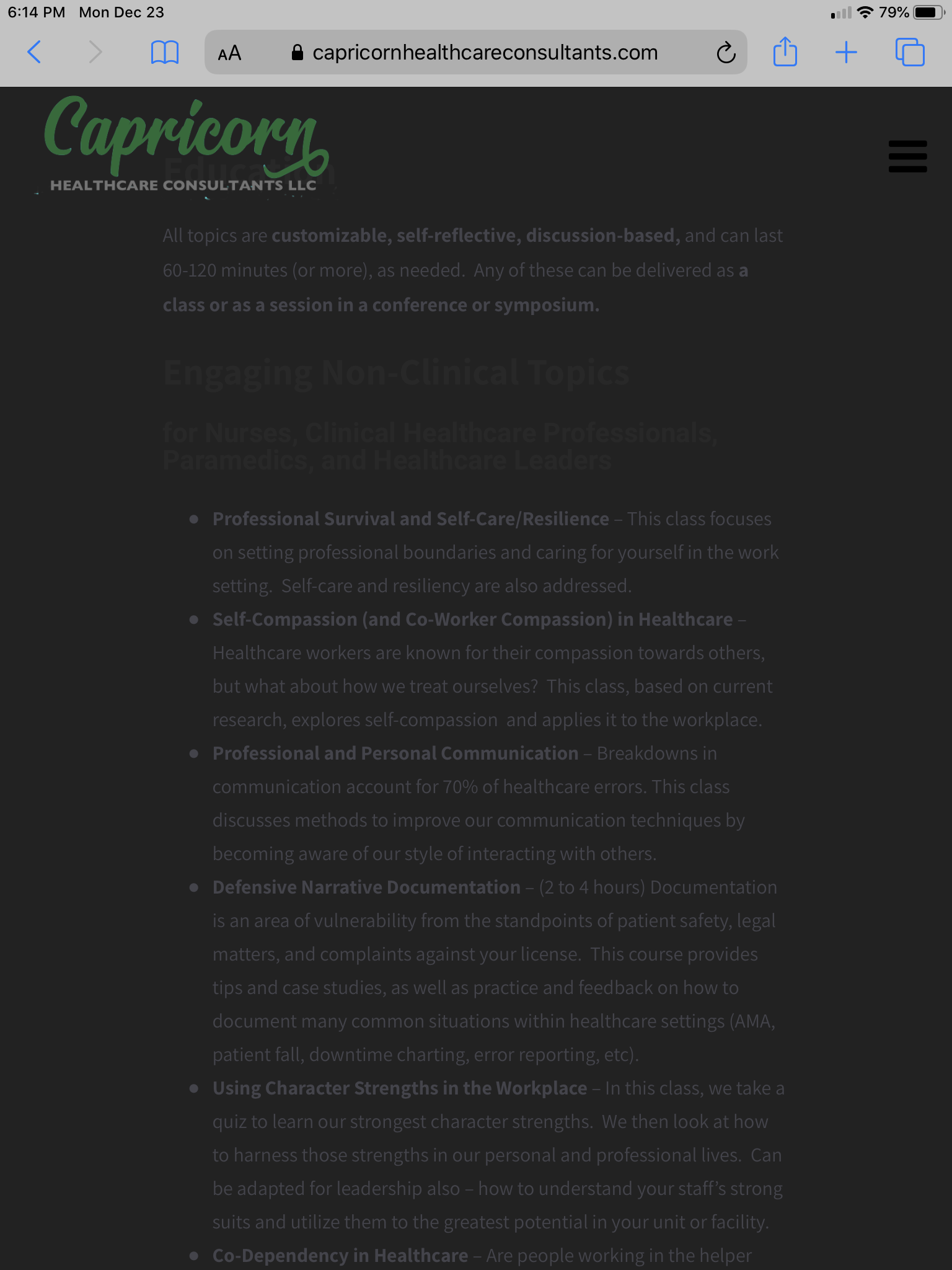
There continues to be a number of issues with the mobile version of the current site I am building. Dave has helped me kill a number of bugs. The media screens for phones finally looks acceptable, but the media screen for tablets continue to be a huge headache, and my client wants them fixed.
Here’s a screen shot that shows two current issues:
• Still seeing overlap between the logo and the page titles
Screenshot: http://originalcent.com/wp-content/uploads/2019/12/IMG_0002.png
Website in question: http://capricornhealthcareconsultants.com
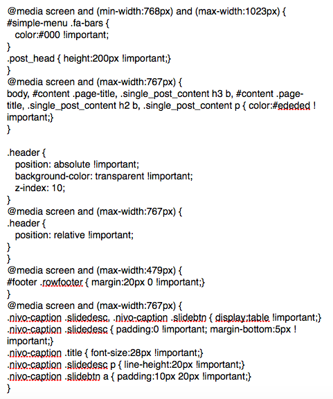
We’ve added a lot of custom CSS lately. I’m not sure how to post that here, so I did a screenshot of the current CSS additions: http://originalcent.com/wp-content/uploads/2019/12/Capsite-Custom-Notes.png
Sonal S Sinha Moderator
Topics: 0 Replies: 31231 Total: 31231
Member since: August 16, 2013
Hi,
Remove
@media screen and (max-width:767px) {
#content .page-title, .single_post_content h3 b { color:#ededed !important;}
}
And add this New CSS:
@media screen and (max-width:767px) {
body, #content .page-title, .single_post_content h3 b, #content .page-title, .single_post_content h2 b, .single_post_content p { color:#ededed !important;}
}
Regards,
Sonal S Sinha Moderator
Topics: 0 Replies: 31231 Total: 31231
Member since: August 16, 2013
Hi,
Kindly use this CSS
@media screen and (min-width:768px) and (max-width:1023px) {
#simple-menu .fa-bars {
    color:#000 !important;
}
.post_head { height:200px !important;}
}
Regards,