
Is your site optimized with foldable screens in mind? Discover how shifting mobile hardware impacts your layout and why adapting is so crucial.
Table of Contents
“Foldable devices are the next major evolution in digital design.”
The flexibility of your website is unequivocally a massive factor in keeping visitors engaged and avoiding frustrating mobile experiences.
And while foldable technology is still gaining ground, industry leaders have implied its importance for years.
But how to upgrade a website structurally and visually for these dynamic screens is a practice that eludes many business owners.
The good news is that there are proven methods to improve your site’s adaptability today.
Let’s start now.
Here is exactly how the Apple iPhone Duo changes digital expectations, plus strategies to make your platform incredibly user-friendly.
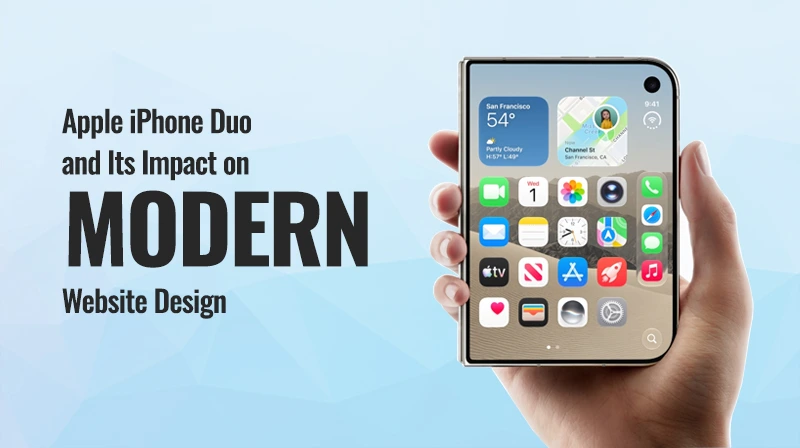
What Is Apple iPhone Duo?
The Apple iPhone Duo represents a massive shift toward dual-screen, foldable technology.
In this way, hardware creators are building devices that accommodate multiple viewing modes seamlessly.
This topic is attracting serious attention because it directly alters how we interact with digital media.
This means it is essential for website owners to realize that rigid, fixed-width pages are no longer acceptable on modern devices.
Why Smartphone Trends Matter for Website Designers?
Many creators have been slow to adapt, despite the slew of data showing mobile usability drives revenue.
These are some of the biggest reasons it should be high on your priority list.
Increasing mobile browsing and varying screen sizes completely change the game.
With more users relying on touch-based interactions than ever before, audiences now have much higher expectations for speed and usability.
How Apple iPhone Duo Could Influence Modern Website Design
When you prioritize the flexibility of your layout, you necessarily start paying attention to the entire user journey.
These upcoming hardware shifts will force a total rethink of standard digital architecture.
Mobile-First Website Design
- It’s no secret that the industry has moved toward a “mobile-first” mindset.
- This means designing for smaller screens first, before scaling up for desktop monitors.
- You must simplify your layouts and prioritize important content immediately.
- It makes it easier for users to find essential actions without pinching or zooming.
Responsive Website Layouts
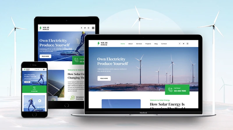
- A fluid design is essential in creating a positive experience for varying display ratios.
- Websites should adapt effortlessly through flexible grids and responsive containers.
- This ensures that images and typography scale perfectly on any device.
- Consistent experiences across platforms keep visitors happy and encourage them to return.
Touch-Friendly Navigation
- Navigation design is another factor that greatly impacts your bounce rate.
- If you use tiny links or crowded interfaces, users will simply drop off and look elsewhere.
- Providing larger buttons and better spacing between clickable elements is a must.
- Easy-to-use menus can be a strong indication of whether your site truly satisfies the mobile user.
Mobile Typography
- Text that looks great on a laptop might be entirely unreadable on a compact screen.
- You need readable font sizes and appropriate line height to keep audiences engaged.
- Establishing a strong content hierarchy makes easy scanning possible on smaller panels.
- Plus, happy readers are far more likely to turn into paying subscribers.
Optimized Images and Media
- High-quality visuals are fantastic, but large files can easily break your layout.
- Use properly sized images and modern formats like WebP or AVIF where appropriate.
- Implement lazy loading to avoid loading unnecessary large media files all at once.
- Optimize your media today for more traffic and fewer rendering hiccups.
Why Website Speed Matters on Modern Smartphones?
- How quickly your pages load can make or break a digital marketing campaign.
- It doesn’t just come down to aesthetics; speed is a fundamental usability factor.
Faster-Loading WordPress Websites
- If your web design makes it difficult to render quickly, visitors will immediately look for information elsewhere.
- Reduce unnecessary scripts and optimize your CSS and JavaScript to speed things up.
- Compressing your images and using robust caching and CDN solutions makes a world of difference.
- These steps ensure your WordPress site loads faster on any connection.
Core Web Vitals
- Google is primarily concerned with keeping searchers happy with fast, stable sites.
- Metrics like LCP, INP, and CLS track exactly how your pages perform in the real world.
- Better performance in these areas directly improves the overall mobile experience.
- Create a fast, stable site, and search engines are highly likely to reward you.
Apple iPhone Duo and the Future of Mobile UX
When users like your interface, they are much more likely to engage deeply with your brand.
Simpler User Interfaces
- Modern audiences prefer less visual clutter and significantly more white space.
- A clear content hierarchy paired with focused calls to action wins every time.
- This straightforward approach helps users find exactly what they need instantly.
Better Interactive Experiences
- Many developers build sites with smooth scrolling and touch-friendly controls in mind.
- Responsive menus and accessible interactive elements make mobile browsing a joy.
- These smooth interactions encourage users to stay on your site far longer.
Consistent Cross-Device Experiences
- Your audience might switch from smartphones to tablets, and eventually to desktops.
- Accommodating different screen resolutions ensures your branding never feels broken.
- This cross-device continuity builds deep trust with your customer base over time.
What WordPress Website Owners Can Learn From iPhone Trends
Establishing a mobile-friendly strategy as the base of your redesign will set you up for long-term success.
Build mobile-first and always use responsive layouts from the very beginning.
Keep your navigation simple, optimize your images, and constantly improve website speed.
Use readable typography, make buttons touch-friendly, and strictly monitor your Core Web Vitals.
And most importantly, test across multiple devices before launching any major updates.
To make all of this easier, always choose a responsive WordPress theme.
Choosing a Responsive WordPress Theme for Modern Devices
Having a solid framework from the get-go will help set your site up for SEO success.
Look for Mobile Responsiveness
Your chosen template must feature automatic layout adaptation right out of the box.
Check for mobile-friendly menus and flexible content sections that shift naturally.
Prioritize Performance
A theme built with lightweight code is absolutely essential for modern ranking algorithms.
Optimized assets lead directly to fast page loading, which keeps impatient visitors engaged.
Check Customization Options
You want robust typography controls and responsive spacing options readily available.
Flexible header and footer layouts give you total creative freedom without manual coding.
Consider Accessibility
A great digital experience also means good color contrast and highly readable typography.
Keyboard accessibility and proper buttons are vital for a truly inclusive layout.
How SKT Themes Helps Build Mobile-Friendly Websites?
Are you ready to step it up with a highly adaptable, professional design?
SKT Themes provides responsive WordPress themes tailored specifically for dynamic modern devices.
They focus heavily on mobile-friendly layouts, industry-specific designs, and deep customization options.
With performance-focused design and modern typography controls, your site will look incredible on any screen.
From lifestyle blogs to corporate platforms, they cover different business and website categories effortlessly.
Explore responsive WordPress themes from SKT Themes today to future-proof your digital presence.
iPhone 17 Pro, iPhone 17 Pro Max and Other Smartphone Trends
It’s no secret that consumers heavily research upcoming devices like the iPhone 17 Pro and iPhone 17 Pro Max.
Search data for the iPhone 17 price and the iPhone 17 Pro price in India shows massive commercial intent.
Whether shoppers ultimately buy the iPhone 17 256GB or track updates on the iPhone 18 Pro, hardware matters.
Even queries around the iPhone Duo price prove that users are incredibly eager for next-generation technology.
As consumers move between newer smartphones and different screen formats, your site must adapt seamlessly.
Websites need to provide a consistent, flawless experience regardless of the device being used.
Best Practices for Designing Websites for New Smartphones
Here is a quick checklist to keep your mobile-ready site perfectly optimized:
- Responsive layout
- Mobile-first design
- Touch-friendly buttons
- Readable typography
- Optimized images
- Fast loading
- Simple navigation
- Accessible content
- Stable layouts
- Strong Core Web Vitals
Conclusion
Smartphone technology will continue to heavily influence digital experiences.
The Apple iPhone Duo and newer hardware trends highlight the absolute importance of mobile usability.
Website owners must relentlessly focus on responsive design, loading speed, and accessible interfaces.
WordPress users can achieve these high standards much more easily by leveraging a modern, adaptable architecture.
Don’t let outdated layouts cost you valuable traffic.
Explore SKT Themes today and build a fast, mobile-ready foundation for your business.
Frequently Asked Questions
What is Apple iPhone Duo?
It is a trending foldable device concept highlighting how new hardware formats are changing the tech landscape.
How can smartphone trends affect website design?
Varying screen sizes force developers to abandon fixed layouts in favor of highly adaptable, fluid grids.
Why is mobile-first design important?
It prioritizes the majority of your audience by forcing you to simplify layouts and highlight essential actions first.
What makes a WordPress website mobile-friendly?
It requires readable text, properly spaced buttons, lightweight media, and a layout that adjusts to any screen automatically.
How can I improve my website’s mobile performance?
Compress your images, remove bloated plugins, and utilize aggressive caching to speed up your loading times.
Why are Core Web Vitals important for mobile websites?
These metrics objectively measure how fast and stable your pages are, which directly influences your search rankings.
Are responsive WordPress themes important for modern smartphones?
Absolutely. They provide the necessary coding framework to ensure your content looks perfect on both small screens and large monitors.

