Home › Forums › All Other Themes › At the time of mobile android Small screen
- This topic has 22 replies, 3 voices, and was last updated 6 years, 10 months ago by
Sonl Sinha.
-
AuthorPosts
-
January 20, 2018 at 3:20 pm #92194
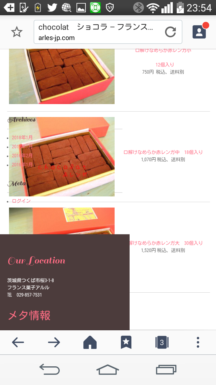
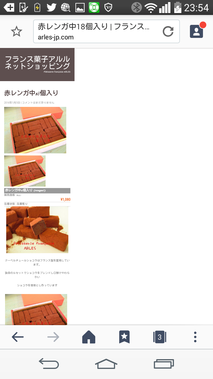
Website: http://arles-jp.com/macaron/
Theme: Bakery Pro
1&2: http://arles-jp.com/macaron/2016/01/05/renga18/
3: http://arles-jp.com/macaron/chocolat01/
How are you recovered if you do it?
 January 21, 2018 at 10:20 am #92221
Six Comments page & post page are troubles
Half of the screens become below very slim when they look with a smartphone.
Somebody help me, please
———————————————————-
http://arles-jp.com/macaron/chocolat01/
http://arles-jp.com/macaron/2016/01/03/renga12/
http://arles-jp.com/macaron/2016/01/05/renga18/
http://arles-jp.com/macaron/yakigashigift/
http://arles-jp.com/macaron/577-2/
January 21, 2018 at 10:46 am #92222Seem to be caused by the fact that become when input the link of the product of the shopping; can not be settled?
(It is easy, and the method of this link is good, but the thumbnail shows, too and is very good)
January 21, 2018 at 11:18 am #92223This is the common thing which linked a page on a letter,; but as for this
When a screen is a smartphone, I narrowI do not understand a no use reason even if I turn off plug in of the shopping.><,When it is a smartphone, a screen collapses thin
January 21, 2018 at 1:17 pm #92225The product page was recovered when I remade it.
The fixed page is not recovered
January 21, 2018 at 1:46 pm #92227January 21, 2018 at 1:48 pm #92228January 22, 2018 at 7:04 am #92308Kindly send us WordPress admin details via sktthemes.net/contact Will solve the issues.
Regards,
ShriJanuary 23, 2018 at 2:19 pm #92501It is one information
I made a new product with the setting of the same permanent link in a test site, but the image of the product does not appear in the top page.
It is linked to the latest contribution
The second
In the shopping site of the problem
An image disappears if I turn off Welcart e-Commerce plugJanuary 24, 2018 at 7:18 am #92580Hi,
Kindly go to Appearance >> Theme Options >> Basic Settings >> Custom CSS Box:
Add this code there:
@media screen and (max-width:479px) {
.entry-content table, .item_option, .wp-embedded-content, #loginformw input { width:100% !important;}
.itemimg img { width: 100%;}
.ucart_calendar_body.ucart_widget_body li table { width: 100% !important;}
#itempage .assistance_item .detail { padding-left:0; float:right;}
#itempage .assistance_item .slit { display:inline-block; float:none !important;}
#itempage .assistance_item h3 { height:auto; line-height:28px;}
}
Regards,
ChrisJanuary 24, 2018 at 12:02 pm #92629Thank you!
Because you still have a problem with the top page, please last
Keep up the good work
January 24, 2018 at 12:07 pm #92631#92630 Here it is.
January 25, 2018 at 5:08 am #92676Hi,
Kindly show us the Url of that page where you want the changes to happen.
Regards,
ChrisJanuary 25, 2018 at 5:23 am #92679Thank you!
This is a problem same in the mobile and the wide screen
I appear in the top page when I make a new product, and a design collapses
January 25, 2018 at 6:36 am #92702Hi,
Issue resolved from our end. Kindly check and confirm.
Regards,
Chris -
AuthorPosts
- You must be logged in to reply to this topic.

