SKT Responsive - Mobile Ready WordPress Theme
- Updated July 2026
- Working With Latest WordPress Version
- Updated Google fonts for GDPR and Other Country Privacy
- Updated to work with PHP 8+
- Updated to work with at least one page builder (Elementor, Gutenberg or SKT Builder)
- Compatible with popular plugins of SEO, contact form and WooCommerce
- Updated performance to work with popular cache plugins and Cloudflare
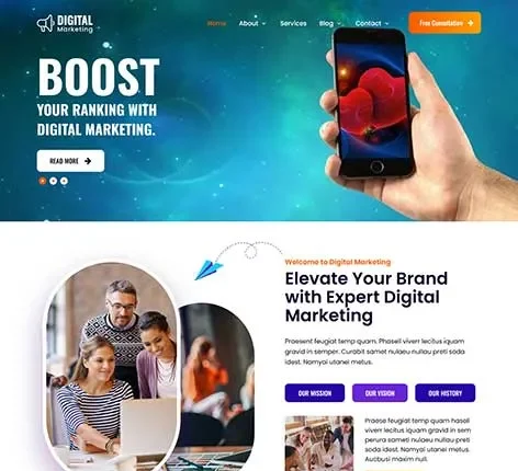
Why SKT Responsive Design is the Best Mobile Ready WordPress Theme
With over 60% of web traffic now coming from mobile devices, having a website that looks good on a desktop is no longer enough. If your site isn’t easy to use on a phone, you are losing visitors, customers, and search engine rankings every single day.
SKT Responsive Design by SKT Themes is a premier Mobile Ready WordPress Theme built to solve this exact problem. It ensures that whether your visitor is on a giant monitor or a small hand-held phone, your content looks perfect, loads fast, and works smoothly.
Why a Mobile Ready WordPress Theme is Mandatory?
A Mobile Ready WordPress Theme is not a luxury—it is a requirement. Google now uses “Mobile-First Indexing,” which means it looks at the mobile version of your site to decide how high you should rank.
Who Can Use the Mobile Ready WordPress Theme?
- Online Retailers: Shoppers need a mobile ready website template with a thumb-friendly checkout process.
- Creative Professionals: Photographers and designers need their portfolios to shine on high-definition mobile screens.
- Restaurants: Hungry customers need to view digital menus and book tables quickly while on the go.
- Real Estate Agents: Buyers want to swipe through property listings and maps effortlessly from their phones.
- Non-Profits: Making it easy for supporters to send mobile donations with one tap can change the world.
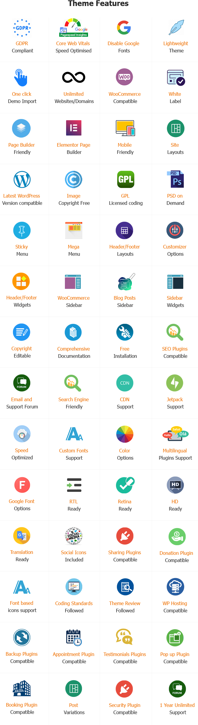
Unique High-Value Features of Mobile Ready WordPress Theme
To build a site people trust, you need tools that prioritize mobile users. Here are over 20 reasons why this WordPress Mobile Ready theme is the top choice for 2026:
Fluid Responsive Layout:
Your site automatically adapts to any screen size, from 4-inch phones to 32-inch monitors.
Finger-Friendly Navigation:
Buttons and menus are spaced out so users don’t accidentally click the wrong link with their thumbs.
Lightning-Fast Loading:
Mobile users are often on slower data plans. This theme is “lightweight” to ensure your site pops up instantly.
One-Click Demo Import:
Start with a professional look immediately. No design skills are required to get a world-class Mobile Ready theme.
Retina-Ready Graphics:
Images stay crisp and sharp on high-end smartphone screens, making your brand look high-quality.
SEO Optimized Code:
This WordPress theme for mobile-ready use follows all of Google’s rules to help you show up on the first page.
Mobile Donation Ready:
Perfect for non-profits needing secure, easy-to-use payment buttons for mobile supporters.
Digital Menu Layouts:
Restaurants can display menus in a format that is easy to read without zooming in and out.
Real Estate Listing Support:
High-density grids make it easy for users to browse dozens of homes on a small screen.
Educational Portal Friendly:
Students can access mobile learning materials and PDFs without any glitches.
Social Media Quick-Share:
Mobile-optimized sharing buttons make it easy for your content to go viral on apps like WhatsApp and Instagram.
Drag-and-Drop Editor:
You can build your site visually. If you can move a mouse, you can design a professional site.
WooCommerce Compatibility:
Sell anything online with a checkout process designed specifically for mobile shoppers.
Google Maps Integration:
Help mobile users find your physical store or event location with one-tap navigation.
Secure Coding:
We follow the latest web safety standards to protect your data and your visitors’ privacy.
Translation Ready:
Reach a global audience by translating your site into any language with ease.
Contact Form Optimization:
Forms are easy to fill out on a mobile keyboard, ensuring you don’t lose leads.
Unlimited Color Choices:
Match your site to your brand colors in seconds using a simple color picker.
Regular Updates:
We keep the theme up to date so it always works with the latest versions of WordPress and Android/iOS.
Professional Support:
Our team is here to help you if you ever have a question or need a hand.
Light/Dark Mode Options:
Give your mobile users the choice to switch modes, making it easier to read at night.
App-Like Experience:
The theme feels like a high-end mobile app, keeping users engaged longer.
Launch Your Mobile-Ready Website in 3 Easy Steps
Setting up your Mobile Ready theme is as easy as:
- Install the Theme: Upload SKT Responsive Design to your WordPress dashboard.
- Import the Demo: Choose a layout that fits your business (Corporate, Restaurant, Education, etc.).
- Customize: Add your logo, text, and photos. The theme does the hard work of making sure they look great on mobile!
Conclusion:
Whether you are a freelancer, a news outlet, or a large corporate firm, your audience is looking for you on their phones. Using a generic, old-fashioned theme is like giving your visitors a map that is upside down.
By choosing SKT Responsive Design, you are choosing the best mobile ready WordPress Theme for your future. You are telling your audience that you value their time and their experience. Stop losing visitors to “non-responsive” designs and start your journey toward a better, faster, and more accessible website today.
Are you ready to see how your site looks on a mobile device? Get SKT Responsive Design today and join the mobile revolution!
Frequently Asked Questions (FAQs) – Mobile Ready WordPress Theme
1. What is a Mobile Ready WordPress Theme?
A Mobile Ready WordPress Theme is designed to ensure that your website is fully optimized for mobile devices, providing a seamless experience for visitors across smartphones, tablets, and other mobile platforms. It ensures fast loading times, easy navigation, and accessibility on all devices.
2. Who should use the SKT Responsive Mobile Ready WordPress Theme?
The SKT Responsive theme is perfect for bloggers, small business owners, online retailers, photographers, designers, non-profit organizations, restaurants, educational institutions, real estate agents, event planners, and more. If you need a mobile-optimized website, this theme is for you.
3. Is this theme suitable for online stores?
Yes! The SKT Responsive theme is great for online retailers as it ensures mobile-optimized checkouts, improving the shopping experience for your customers on mobile devices.
4. Can I showcase my portfolio with this theme?
Absolutely! This theme is perfect for creative professionals like photographers, designers, and artists to showcase their portfolios, providing a mobile-friendly and visually appealing layout.
5. How does the theme benefit restaurants?
The SKT Responsive theme allows restaurants to share digital menus, promote specials, and facilitate online reservations, all with a mobile-optimized design that’s easy for customers to navigate.
6. Can educational institutions use this theme?
Yes! Educational institutions can use the SKT Responsive theme to offer mobile learning portals, ensuring that students have a seamless experience on mobile devices, no matter where they are.
7. Is this theme mobile-friendly for event planners?
Yes! Event planners can use the SKT Responsive theme to showcase events, sell tickets, and provide event details, all optimized for mobile devices for easy access on the go.
8. Does this theme help with SEO optimization?
Yes! The SKT Responsive theme is built with SEO best practices, ensuring that your mobile-friendly site ranks well on search engines and reaches a wider audience.
9. Can real estate agents use this theme to display property listings?
Definitely! Real estate agents can use the SKT Responsive theme to display property listings in an organized, mobile-friendly manner, making it easy for potential buyers to browse properties on any device.
10. How does this theme improve my site’s accessibility?
The SKT Responsive theme is designed to be accessible on all devices, ensuring your content is available to all users, regardless of the device or screen size they are using.
Also Included with Mobile Ready WordPress Theme
-
Theme Files
Theme files are included in the zip you get when purchased
-
Sample Content
1 click demo import to set up all the content of all pages easily
-
Support
You will get a login for our support forum and our email ID and Skype ID after purchasing a theme
-
PSD Design Files
Includes PSD format file so that in case you need any design changes first in order to modify the theme you can do so. All Themes Bundle users will have to demand PSD files since including so many PSD files is not possible. Single theme users can get the PSD design files on demand.
-
Free Installation
You will get free installation if you request us to install the Mobile Ready WordPress Theme on your server with demo content
John K. Brookins –
Clean, flexible, and fully responsive design that looks great on all devices. Setup was effortless and highly professional!