SKT Adaptive - Mobile Friendly WordPress Theme
- Updated July 2026
- Working With Latest WordPress Version
- Updated Google fonts for GDPR and Other Country Privacy
- Updated to work with PHP 8+
- Updated to work with at least one page builder (Elementor, Gutenberg or SKT Builder)
- Compatible with popular plugins of SEO, contact form and WooCommerce
- Updated performance to work with popular cache plugins and Cloudflare
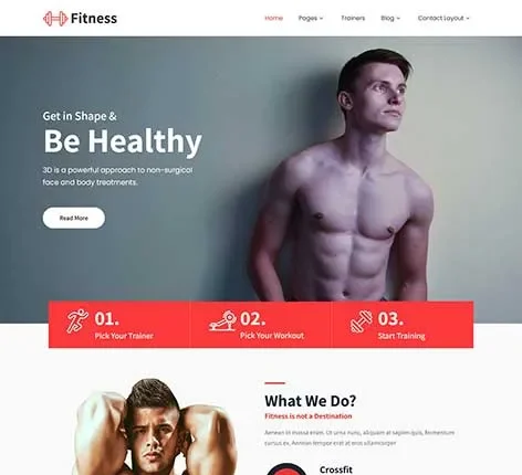
Best Mobile Friendly WordPress Theme
In the modern digital economy, your desktop website is no longer the main event—it is the afterthought. With over 60% of all global web traffic originating from smartphones, and Google enforcing strict mobile-first indexing, your website’s smartphone layout determines your revenue. If your site pinches, zooms, or stutters on a mobile device, visitors will leave your page before it even finishes loading.
To build a sustainable digital brand, lower your ad drop-off rates, and skyrocket your organic traffic, you need a lightweight layout framework engineered specifically for small screens.
SKT Adaptive by SKT Themes is a premium, high-performance Mobile Friendly WordPress Theme built from the ground up for mobile-first environments. It blends a clean, modern grid layout with thumb-optimized navigation to turn scrolling visitors into paying customers.
The Blueprint of a Mobile Friendly WordPress Theme
A premium WordPress Mobile Friendly theme does much more than shrink images to fit a smaller screen. It changes how layout elements are organized to make touch interactions completely seamless.
Why Standard Templates Fail the Mobile Test?
Many multi-purpose corporate templates claim to be responsive, but they are actually desktop designs crammed into a mobile layout. This results in tiny text, hidden call-to-action buttons, and heavy background images that destroy mobile data plans.
Choosing a dedicated Mobile Friendly Website Template like SKT Adaptive guarantees that your asset files are compressed and touch targets are correctly scaled from the moment your site goes live.
High-Performance Features of Mobile Friendly WordPress Theme
Before executing a Mobile Friendly theme download, a business owner must verify the underlying technical infrastructure. Here are the main core features engineered directly into SKT Adaptive:
1. Blazing-Fast Mobile Loading Speeds (Performance First)
Mobile users expect pages to load instantly, even on 4G networks. This theme uses highly optimized backend code to minimize asset requests, ensuring your site renders instantly to hit perfect scores on Google Core Web Vitals.
2. True Fluid Responsive Engine
No screen size is left behind. This WordPress themes for Mobile Friendly use scales smoothly across cheap smartphones, premium foldable devices, tablets, and massive 4K desktop screens without breaking your layout alignment.
3. One-Click Mobile Demo Importer
Skip the long development cycles. Use our automated setup tool to import a complete, pre-configured mobile layout structure in seconds, then simply drop in your brand media and copy.
4. Thumb-Optimized Sticky Navigation Menus
Keep users grounded. A custom floating header or bottom navigation bar stays pinned to the screen as users scroll, giving them one-tap access to your core pages and contact channels.
5. Seamless WooCommerce Checkout Loops for Mobile Shopping
Maximize your mobile store conversion rates. This Mobile Friendly theme for WordPress integrates directly with WooCommerce, offering simplified single-column cart pages and big, touch-friendly payment buttons.
6. Interactive Swipe-to-Browse Portfolio Grids
Let users engage with your work naturally. Integrated mobile touch gestures allow visitors to swipe through project galleries, case studies, and corporate photo blocks just like a native app.
7. Drag-and-Drop Visual Page Builder Integration
You don’t need to write code to build a world-class mobile experience. Use standard visual builders like Elementor to arrange content, adjust margins, and build landing pages visually.
8. High-Contrast Typography Optimized for Small Screens
Reading text on a phone shouldn’t strain the eyes. Access hundreds of premium Google Web Fonts to select crisp, scalable typefaces that look stunning on compact displays.
9. Dynamic Accordion and Tabbed Content Panels
Save valuable screen space. Use collapse modules to organize long text layers—like product features or legal disclosures—into expandable panels that keep your pages clean.
10. Lightweight, High-Definition SVG Graphic Support
Keep your site sharp without slowing it down. The theme fully supports scalable vector graphics (SVGs), ensuring icons, logo marks, and branding elements stay perfectly crisp on high-end Retina screens.
11. Built-In Mobile SEO Rich Schema Markup
Help search engines map your site structure accurately. The code base features schema hooks that tell Google’s mobile crawlers exactly where to find your service categories, localized office locations, and user reviews.
12. App-Style Mobile Pop-Ups and Callouts
Grab user attention without blocking their view. The theme includes styled notification banners and slide-in modules that are perfectly balanced for small screens to collect emails or promote flash sales.
13. High-Converting Mobile Lead Forms
Forms are notoriously difficult to fill out on phone keyboards. SKT Adaptive uses wide form layouts and auto-tab entry setups to make it incredibly easy for users to drop in their details.
14. Enterprise-Grade Security and Clean Coding Core
Protect your mobile user interactions and billing data from external threats. The theme follows strict WordPress security protocols, keeping your site data shielded and your customers safe.
15. Translation-Ready and Multilingual String Mapping
Scale your brand globally across language barriers. The theme is fully localized and translation-ready, making it simple to present your mobile-friendly site in multiple languages.
16. Quick-Action Click-to-Call and Map Integration
Drive immediate conversions. Custom header tools let mobile users tap a button to dial your phone line or open turn-by-turn driving directions in Google Maps instantly.
17. Optimized Video Background and Asset Frameworks
Heavy media won’t crash your mobile site. The framework automatically detects mobile users and pauses battery-draining animations or swaps heavy background videos for optimized static images.
18. Unlimited Live Color Swatch Options
Align the website UI perfectly to your physical branding and assets. Shift your background colors, link selections, button gradients, and hover highlights in real time using a live color picker.
19. Clean Content-Rich Editorial Blog Structures
Build an organic traffic machine. Use beautifully styled article archives to share trend insights, product reviews, company updates, or viral stories inside crisp reading screens.
20. Precise interactive Google Maps Integrations
Ensure local fans, retail shoppers, or clients can pin down your brick-and-mortar flagship store, studio, or gym warehouse effortlessly via responsive map boxes embedded into your Contact pages.
21. Constant Lifelong Core Theme System Upgrades
The underlying digital framework of WordPress updates continuously. This theme receives regular performance modifications from engineering teams to guarantee long-term system stability.
22. 24/7 Professional Technical Support Helpdesk Access
Never get stuck handling a launch hurdle alone. Your acquisition includes direct, ongoing support channels to a specialized team of expert WordPress developers ready to help you tune your site elements.
Who Can Leverage this Mobile Friendly WordPress Theme?
The flexible architecture of this WordPress Mobile Friendly themes choice caters to any brand that values raw energy and conversion speed:
SaaS & Tech Startups: Optimized to showcase software features, pricing tiers, and mobile-friendly trial sign-ups.
E-Commerce Brands: Tailored for fast-loading mobile shopping, interactive lookbooks, and friction-free payment flows.
Consultants & Agencies: Built to display professional portfolios and book client strategy calls via mobile-friendly calendars.
Local Service Providers: Designed to drive instant phone calls, map directions, and service quote requests from users on the move.
How to Design a Mobile-Friendly Website by Using SKT Adaptive Theme
Step 1: Choose Your Base Theme
Theme: SKT Adaptive – designed to create fully responsive, mobile-first websites
Interactive Tip:
Include a live demo toggle: “Preview SKT Adaptive Theme”
CTA: “Experience Your Mobile-Friendly Website in Action”
Step 2: Plan Your Website Structure
Recommended Pages & Headings:
Home – Seamless Mobile Experience
About – Learn About Our Services
Features / Services – Explore Our Capabilities
Blog / News – Updates on Mobile Optimization
Contact – Get in Touch or Request a Demo
Keyword Integration:
Include WordPress Mobile Friendly theme and Mobile Friendly Website Template naturally in headings and meta descriptions
Interactive Tip:
Drag-and-drop sitemap preview for mobile-first navigation
Step 3: Customize the Theme Appearance
SKT Adaptive Features:
Fully responsive and mobile-optimized design
Pre-built sections for features, testimonials, and services
Customizable fonts, colors, and header/footer layouts
Interactive Tip:
Live color palette picker with mobile-friendly contrast schemes
CTA: “Apply Theme Colors Live”
Step 4: Add Content for Your Mobile-Friendly Website
Page-specific Content & Keyword Integration:
It uses clear text to welcome visitors on the Home page, showcase software capabilities on Features, build trust on About, attract organic search traffic via the Blog, and drive leads on the Contact page.
Interactive Tip:
Highlight where focus keywords appear naturally in headings and content
Step 5: Add Interactive Features
Responsive Slider / Showcase: Highlight mobile-optimized content
Testimonials / Reviews: Showcase client success stories
Interactive Demo Module: Let users test mobile responsiveness
Newsletter Signup: Engage visitors with mobile alerts
Step 6: SEO & Meta Optimization
SEO & Meta Optimization is the process of writing hidden titles and short summaries that tell search engines like Google exactly what your website is about so it can rank higher and show your mobile-friendly WordPress theme to customers looking for responsive designs.
Interactive Tip:
Meta preview simulator for desktop and mobile search results
Step 7: Test & Launch
Preview website on desktop, tablet, and all mobile devices
Test forms, sliders, and interactive elements
Optimize images, loading speed, and mobile performance
Interactive Tip:
Checklist gamification: users can mark each launch step complete for progress tracking
Conclusion:
Your business operates in a fast-paced, mobile-first world—your website design should project that exact same level of responsiveness. Relying on slow, basic corporate templates dilutes your brand’s voice and buries your business deep within search engine results pages.
Deploy SKT Adaptive to establish a modern, high-converting digital platform that matches the true scale of your brand’s ambition.
Explore the live layout configurations on the official SKT Adaptive Product Page today, and build a digital showroom that converts scrolling traffic into a loyal community!
Also Included with Mobile Friendly WordPress Theme
-
Theme Files
Theme files are included in the zip you get when purchased
-
Sample Content
1 click demo import to set up all the content of all pages easily
-
Support
You will get a login for our support forum and our email ID and Skype ID after purchasing a theme
-
PSD Design Files
Includes PSD format file so that in case you need any design changes first in order to modify the theme you can do so. All Themes Bundle users will have to demand PSD files since including so many PSD files is not possible. Single theme users can get the PSD design files on demand.
-
Free Installation
You will get free installation if you request us to install the Mobile Friendly WordPress Theme on your server with demo content
Reviews
There are no reviews yet.