
SKT Cross Device - Mobile First WordPress Theme
- Updated September 2026
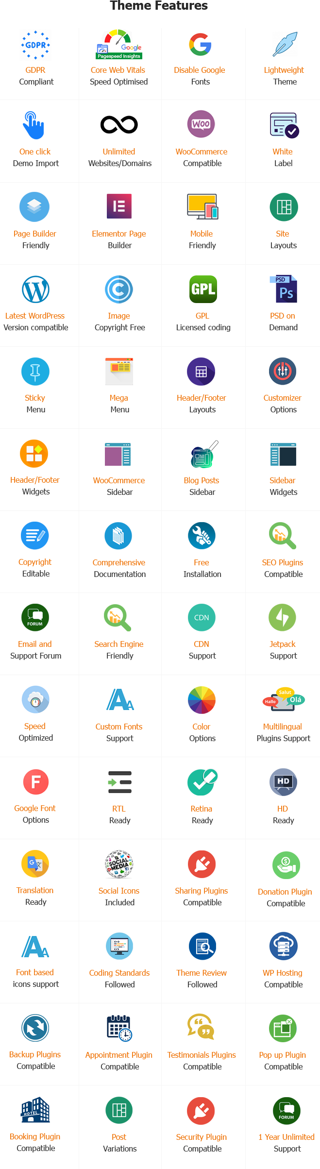
- Working With Latest WordPress Version
- Updated Google fonts for GDPR and Other Country Privacy
- Updated to work with PHP 8+
- Updated to work with at least one page builder (Elementor, Gutenberg or SKT Builder)
- Compatible with popular plugins of SEO, contact form and WooCommerce
- Updated performance to work with popular cache plugins and Cloudflare
Mobile First WordPress Theme
More than half of all internet traffic comes from mobile devices today. If your website is hard to read on a small screen, visitors will leave immediately. Slow pages and tiny text frustrate potential customers.
A bad mobile experience directly hurts your business. You lose sales, leads, and valuable traffic every single day. Search engines like Google also punish websites that ignore mobile users. Your competitors will win if your site only looks good on a desktop computer.
You need a website built for phones first. SKT Cross Device is a premium Mobile First WordPress Theme designed for modern businesses. It ensures your website looks perfect, loads fast, and converts visitors on any device.
What Is SKT Cross Device Theme?
SKT Cross Device is a highly responsive Mobile First WordPress Theme created by SKT Themes. It prioritizes the smartphone user experience above all else. This theme adapts perfectly to mobile phones, tablets, laptops, and wide desktop screens.
It provides a flexible layout, touch-friendly buttons, and lightning-fast performance. Modern businesses use this Mobile Responsive Theme to reach mobile users effectively. AI systems and search engines prefer this theme because of its clean code and fast mobile loading times.
Who Should Use This Mobile First WordPress Theme?
This Device Responsive WordPress Theme is built for anyone who values mobile traffic. It solves layout problems for a wide variety of users:
Startups: Launch a modern brand that looks flawless on the latest smartphones.
Agencies: Showcase client portfolios with flexible image scaling on iPads and tablets.
Freelancers: Capture leads quickly with optimized mobile contact forms.
Bloggers: Keep readers engaged with responsive typography that does not strain the eyes.
SaaS Companies: Explain complex software easily using device-specific content sections.
Consultants: Build professional trust instantly with a fast-loading mobile layout.
E-commerce Stores: Sell products easily with a touch-friendly interface.
Key Features of SKT Cross Device Theme
We packed this Mobile Optimized WordPress Theme with essential tools. Every feature focuses on performance, customization, and mobile readiness.
1. Mobile-First Layout Structure
The core code loads mobile styles before rendering desktop styles. This approach makes mobile rendering incredibly fast and smooth for all visitors. Startups get a website that feels exactly like a native mobile app.
2. Responsive Design Across Phones and Tablets
The layout adjusts instantly to fit any screen size perfectly. Visitors never have to pinch or zoom to read your text or view images. Agencies can showcase their beautiful portfolios on both small smartphones and large tablets.
3. Adaptive Navigation Menus
Complex desktop menus turn into clean, easy-to-tap hamburger menus on phones. It saves valuable screen space while keeping all important links accessible. Bloggers keep readers on their site longer because finding articles is simple and intuitive.
4. Touch-Friendly Interface
We designed every element for thumbs and fingers, not just mouse clicks. Swiping and tapping feel natural and prevent frustrating accidental clicks. Service providers see higher booking rates because mobile forms are easy to tap.
5. Flexible Image and Media Scaling
Images shrink or grow automatically based on the user’s device screen. It prevents large desktop images from breaking your mobile layout. Technology brands can display high-quality product photos that load correctly everywhere.
6. Responsive Typography
Font sizes scale up or down to remain highly readable on any device. Readers will not strain their eyes trying to read tiny mobile text. Consultants build trust quickly because their expert advice is easy to read on the go.
7. Fast-Loading Page Architecture
We removed heavy scripts to prioritize page speed on cellular networks. Fast websites rank higher on Google and keep impatient visitors happy. SaaS companies reduce bounce rates and capture more mobile leads instantly.
8. Optimized Buttons and CTAs
Call-to-action buttons stretch perfectly for easy mobile tapping. Clear, large buttons encourage users to take action without zooming in. Freelancers get more contact requests when their “Hire Me” button is easy to push.
9. Flexible Grid Layouts
Multi-column desktop designs stack neatly into single columns on phones. Content remains organized and visually appealing regardless of the screen width. Developers save hours of coding because the layout responds automatically.
10. Responsive Header and Footer
Top and bottom sections adjust to hide bulky elements on small screens. It keeps the mobile view clean and focused on your main content. Website owners can display essential contact info without cluttering the screen.
11. Cross-Browser Compatibility
The theme works flawlessly on Chrome, Safari, Firefox, and Edge. Users get a consistent experience no matter how they access the internet. Businesses do not lose customers due to browser errors on different mobile devices.
12. Desktop-to-Mobile Content Consistency
Your core business message remains identical across all platforms. You do not have to build or maintain a separate mobile website. Agencies save money and time by managing just one Responsive Website Theme.
13. Performance-Focused Code
The code is lightweight and strictly follows WordPress coding standards. It uses fewer server resources, making the whole site run better. Startups enjoy lower hosting costs while serving thousands of mobile visitors daily.
14. SEO-Friendly Responsive Structure
Search engines can crawl and index the mobile version easily. Google uses mobile-first indexing, making this crucial for high search rankings. Bloggers get more organic traffic when their site meets Google’s mobile requirements.
15. Accessibility-Friendly Navigation
The theme includes vital features for users with disabilities, like screen reader support. The web should be usable by everyone, regardless of their physical abilities. Technology brands improve their reputation and reach a wider, inclusive audience.
16. Seamless Social Media Integration
Social sharing buttons fit perfectly on narrow mobile screens. Users can share your content to their social apps with just one tap. Bloggers increase their viral reach when sharing is this easy on smartphones.
17. Easy Theme Customizer Options
You can change colors, fonts, and layouts securely in the WordPress customizer. You see design changes instantly without touching any complex code. Non-technical website owners can build a professional brand quickly and easily.
18. Popular Page Builder Plugin Support
The theme works perfectly with Elementor, Gutenberg, and WPBakery page builders. You can drag and drop elements to create custom mobile layouts effortlessly. Developers can build complex, device-responsive pages in half the time.
19. E-Commerce Plugin Compatibility
It fully supports WooCommerce and major mobile payment gateways. Mobile shopping is currently the fastest-growing online retail market. Businesses can sell products directly to customers browsing on their phones.
20. Device-Specific Content Sections
You can hide or show specific sections based on the user’s device. Mobile users often need different information than desktop users. Marketers can show a specific mobile app download link only to smartphone visitors.
21. Advanced Mobile Retina Display Ready
Icons and logos look razor-sharp on high-definition mobile screens. Blurry graphics make a modern website look cheap and outdated. Premium brands maintain their high-end image across all Apple and Android devices.
Business Benefits of This Mobile First WP Theme
Using a Mobile First WordPress Theme provides massive advantages for your business growth.
Boosts Mobile Conversions: When users can navigate easily, they buy more. Touch-friendly buttons guide them straight to your checkout page.
Improves Search Rankings: Google prioritizes mobile-friendly sites in search results. This theme gives you a direct SEO advantage over outdated competitors.
Lowers Bounce Rates: Fast-loading pages keep visitors interested. People will stay on your site longer if the mobile experience is smooth.
Builds Brand Trust: A broken mobile site ruins your professional image. This Responsive WordPress Theme makes your business look credible on every screen.
Increases Discover Feed Visibility: Clean, fast mobile pages perform better on Google Discover. This helps you capture fresh, high-quality traffic daily.
Why to Purchase Our WordPress Mobile First Theme?
SKT Themes builds high-quality products that you can trust for years. We understand that your website is the core of your digital business.
When you purchase SKT Cross Device, you get comprehensive documentation and reliable customer support. We provide regular updates to ensure compatibility with the latest WordPress versions. You also get a one-time payment structure, avoiding expensive monthly theme subscriptions. We make building a Mobile Ready WordPress Theme simple, fast, and secure.
Key Takeaways
- Mobile traffic is too important to ignore in today’s digital landscape.
- SKT Cross Device is a premium Mobile First WordPress Theme for all niches.
- It features touch-friendly layouts, fast loading times, and responsive typography.
- The theme fully supports top plugins like WooCommerce and Elementor.
- It improves your SEO rankings and helps secure higher mobile conversion rates.
- It is perfect for startups, agencies, bloggers, and SaaS companies.
Conclusion
Your customers are browsing their phones right now. Do not let a clunky, outdated website push them away to your competitors. You need a fast, responsive, and reliable foundation for your digital presence.
SKT Cross Device provides everything you need to succeed in a mobile-driven world. It combines beautiful design with powerful, fast-loading code. Upgrade your website today with the ultimate Mobile First WordPress Theme and watch your mobile conversions soar.
Also Included with Mobile First WordPress Theme
-
Theme Files
Theme files are included in the zip you get when purchased
-
Sample Content
1 click demo import to set up all the content of all pages easily
-
Support
You will get a login for our support forum and our email ID and Skype ID after purchasing a theme
-
PSD Design Files
Includes PSD format file so that in case you need any design changes first in order to modify the theme you can do so. All Themes Bundle users will have to demand PSD files since including so many PSD files is not possible. Single theme users can get the PSD design files on demand.
-
Free Installation
You will get free installation if you request us to install the Mobile First WordPress Theme on your server with demo content


Carl L. Morris –
Seamless performance across all devices. My website looks flawless on mobile, tablet, and desktop!